Medical appointments web site - ORBE


Problem description:
ORBE is a medical platform thought for selling medical memberships for an account holder and some beneficiaries, they also want to sell medical packages. The business is going to start offering medical consultations with doctors from Clínica Bíblica Hospital. The client had the idea and most of the requirements, so, they needed a nice and proved design that despite the amount of information, shows a very organized and easy to use web site.
The design solution:
This was a project lead by my colleagues HowelHütt, and I got to participate as a part of their team at the begging of 2018. We started analyzing the existing requirements and tried to get involved with all the needs they had. In the process we found other aspects related to the user experience and the platform functionality we added to the flow. Based on this analysis, we propose an alpha architecture which was tested with the card sorting technique. This part of the process let us know about the understanding of the concepts we used, and also gave us an idea of the groups of information people are expecting to see in this kind of site.
Dendrogram resulting from the card sorting exercise
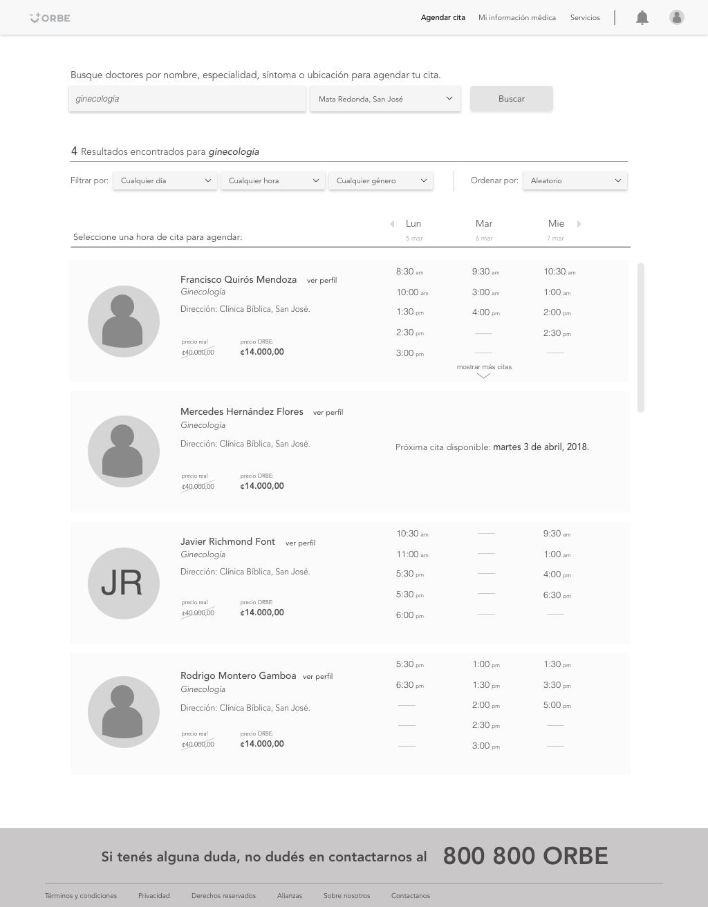
Landing page (left) and booking page (rigth).
Once we had a navigation, we started sketching the wireframes. They were divided by functionality, the main ones are: register, booking appointments, beneficiaries management, account management, medical record consult and services visualization. Those actions were tested by creating some open tasks in order to prove users are finding them, we don’t give steps, we just give them a task that could be something like “you want to book an appointment for gynecology on march 28 with a female doctor”. This kind of task let us know if they are using the elements we are suggesting on the design and also give us a lot of feedback about what is not clear enough.


Here you can see some examples of the wireframes we designed for the site, they are hight fidelity in order to be respected for the creative and IT team. After some testing and meetings we got the final version of the interfaces which now have a good usability level and are ready to be implemented.
The last image is the beta architecture, the one we obtained at the end of the design process, where colors represent navigation levels of the site.
Here you can consult the site: orbevida.com

